Tabs (page elements)
You can group skin elements on tabs. You can then arrange a large number of elements on a skin. The grouping on the tabs preserves the overview while at the same time enabling faster access
Tab element:
"Header" of a tab (page). This contains the label. You can switch between the individual pages by clicking on the tab element.
Group:
All tabs (pages) which are overlaid over one another belong to one group. A group can have any number of pages.
Page:
Area on which skin elements can be positioned. The pages always belong to a group, and are brought to the foreground by clicking on the associated tab element.
To create a tab, you have to create a tab element and the skin elements that you want to arrange on the pages. You then assign these elements to a tab, by specifying the group and page information.
| Before you assign the group and page information for the tab for individual skin elements, you should first create the tab elements with the group and page information. |
To create a new tab element
1 Click with the right mouse button on the SwyxIt! user interface.
The context menu will appear.
2 Click on "New…".
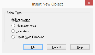
The “Insert new Object” window appears:
3 Then, under “Select type”, click on the option “Action Areas”.
4 Click on “OK”.
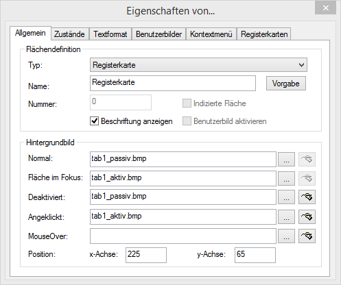
The "Properties of…" window will appear.
5 In the "Type" field, select the option "Tab Element".
7 Create a tab element for each further tab, and assign the corresponding group and page information (tab "Group").
To configure a new tab element
1 Create a new tab element, as described under
To create a new tab element, or click on an existing tab element. The "Properties of…" window will appear.
The option "Tab Element" is selected in the "Type" field.
2 If you want to insert a label for the tab, enter the label of the tab element in the "Name" field and activate the checkbox "Show Text". This label will be saved for the skin. In normal mode, you can change this label for the user profile. See
Changing the Tab Label.
4 No changes are needed for the tab element on the "States" tab, as only one state "page" is present.
5 On the "Text style" tab, you can change the formatting and the position of the label. The fields are only activated if you activate the checkbox "Show text" on the "General" tab.
6 No changes are possible for the tab element on the "User graphic" tab, as no user graphics can be stored for this element type.
9 Create further tab elements as necessary for all pages of all groups.
10 Create the skin elements that you want to arrange on the pages, and give the corresponding group and page information for these elements.
Last modified date: 10.19.2023