This tab helps you to define the general settings for the button.
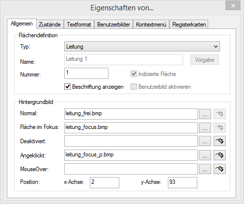
1 Click on "Type" on the button type (function).
2 Enter the text to be used for the label of the button in the “Name” field. You can only change the label for Speed Dial buttons, Line Buttons, and Shortcuts within the configuration of the normal mode, which means after leaving the editing mode.
3 Click on ”Default” to use a possible default text (standard) as the name for the button type selected in ”Type”.
4 Enter a specific number in the “Number” field for Line, Shortcut, and Speed Dial buttons.
If you have copied a speed dial button, you will be able to dial the same destination from both buttons. If you would like to have two buttons, which are assigned with different destinations, then you must give the buttons different numbers. Only then can you assign different Speed Dials to both buttons in the normal mode.
5 The checkbox “Indexed area” indicates that this button type is indexed. It is then possible to assign your own information area to this index. This option is only relevant for line buttons.
Example:
You have a button “Line 1” and a button “Line 2”. You can later add an information area, which is only assigned to Line 1. Here you can display e.g. the call history. This allows you to illustrate the execution of a call and the various connection attempts.
6 Activate the checkbox “Show Text” if you would like to label the button with the text entered under “Name”. The position, color, and font of the text is set on the “Text Style” tab.
7 Activate the checkbox “Enable User Bitmap” so that it is possible for the user to define an image after leaving the Edit Mode. This option is only available for Speed Dials and Shortcut buttons.
8 You define the graphic file which you would like to use for the button background, under “Background image” in the “Normal” field:

Click on

to search for the appropriate files or
Click on

to edit the selected graphic using the linked graphic application.
You must always specify a background image in the "Normal" field. If you leave this field blank, an error message will be displayed when you close the tab.
Define further background images if necessary for specific states of the relevant button.
"Selected" field: The graphic file to be used instead of the normal button background image when this button is active. This option is only available for line buttons and tab elements.
Deactivated: The graphic file to be used instead of the normal button background image when this button is not active.
Clicked: The graphic file to be used instead of the normal button background image when this button is clicked.
MouseOver: The graphic file to be used instead of the normal button background image when the mouse pointer is moved over this button.
If you do not specify a background image for a particular state, the graphic given in the "Normal" field is used.
You can define further background images for button-specific states on the "States" tab.
For formats that don't support transparency, the color of the upper left pixel of the graphic is interpreted as a transparent color. This means that the background graphic of the Skin will show through in all areas of the button background in which this color occurs.
9 The coordinates of the button within the SwyxIt! interface can be defined under “Position” in the “x-Axis” and “y-Axis” fields. The zero point of the coordinate system lies in the upper left corner.